

- Home
- Warm white vs cool white: which for each room?
Warm white vs cool white: settling the 2700K vs 4000K argument.
Our two directors have argued about this for years. One likes a warm 2700K glow at home, the other wants a cooler 4000K so he can see properly. Here is what the research says, and what we would fit in each room.
Written by Michael Simm, Co-founder and Operations Director, SEGplc. Published 1 November 2026.
The short answer
There is no single right colour. Warm white (2700K to 3000K) is best where you relax and in the evening. Cool white (4000K) is best where you work or need to see detail, and many older people prefer it. Daylight (5000K to 6500K) belongs in workshops and garages, not living rooms. And the research is clear on one thing: how much light you have matters more than its colour.
The argument in our office
I like 2700K and 3000K at home. It gives a room a warm glow and feels like home in the evening. Russell, my fellow director, prefers 4000K cool white, because he says he can simply see better under it. He is a little older than me, and as it turns out, that is part of the answer. We are both right, for different reasons.
What the numbers mean
The colour of white light is measured in kelvin (K). The lower the number, the warmer and more yellow the light; the higher the number, the cooler and more blue.
| Colour temperature | Usually sold as | What it looks like |
|---|---|---|
| 2200K | Extra warm, vintage | Candlelight or an old filament bulb on a dimmer. Atmosphere, not for seeing by. |
| 2700K | Warm white | The classic household bulb. Cosy and relaxing. |
| 3000K | Warm white | Still warm, a little crisper and cleaner than 2700K. Halogen downlights were about this colour. |
| 4000K | Cool white or natural white | Neutral white. Clear and bright, the usual choice in offices and schools. |
| 5000K to 6500K | Daylight | Bluish white, like an overcast sky. Very sharp, can feel clinical indoors. |
The European workplace lighting standard, EN 12464-1, groups them the same way: warm below 3,300K, neutral from 3,300K to 5,300K and cool above 5,300K. There is no rule for homes. Building regulations care about how efficient your lights are, not what colour they are, so it is your choice.
What the research says
1. Brightness matters more than colour
In 1941 the Dutch physicist Arie Kruithof suggested that dim light looks best warm and bright light looks best cool. It became lighting folklore. But when researchers, including Steve Fotios at the University of Sheffield, went back over the later studies, they found no consistent effect of colour temperature on how pleasant or how bright a room looks. The thing that consistently mattered was how much light there was. A dim room looks gloomy whatever the colour; a well-lit room looks fine at 2700K or 4000K.
2. Older eyes need a lot more light
As we age, the lens of the eye thickens and yellows. The Fagerhult Lighting Academy puts it simply: a 40-year-old needs about twice as much light as a 20-year-old to see well, and a 60-year-old about four times as much. A yellowing lens also filters out blue, so warm light looks even dimmer and more yellow to older eyes. That is Russell’s point exactly. Cooler light at 4000K, and more of it, makes reading and close work easier.
3. Warm light in the evening helps you sleep
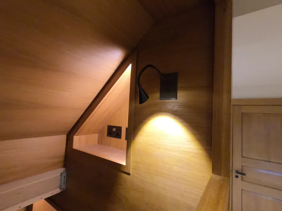
Bright, bluer light in the evening holds back melatonin, the hormone that makes you sleepy. In a 2020 study led by Oliver Stefani, people spent the day under lighting that grew warmer and dimmer towards bedtime. Compared with fixed 4000K lighting, their evening melatonin was less suppressed and they fell asleep faster, with no loss of daytime performance. Warm, dimmable light in the evening is the safe choice for bedrooms and living rooms.
4. Colour rendering matters too
Two bulbs at the same kelvin can make a room look very different. Colour rendering (CRI or Ra) measures how true colours look under the light, out of 100. The workplace standard asks for at least Ra 80 in offices. At home, we would pick Ra 90 or above for kitchens, bathrooms and anywhere you choose clothes or put on make-up.
Our pick, room by room
| Room | Our pick | Why |
|---|---|---|
| Living room | 2700K, dimmable | Relaxing, flattering and evening-friendly. Add a 3000K or 4000K reading lamp if you need one. |
| Bedroom | 2700K, dimmable | Warm and low before bed. A cooler light inside wardrobes helps you see colours. |
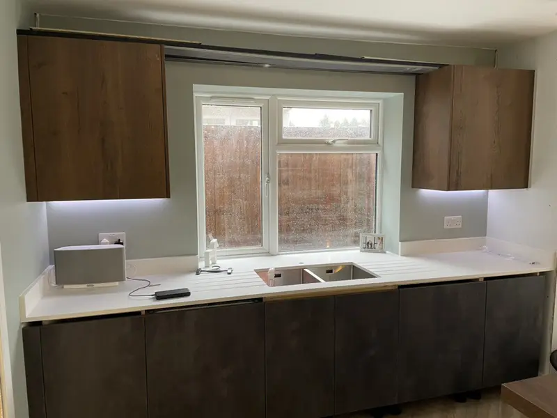
| Kitchen | 3000K, plus 4000K under the cabinets if you like | Warm enough to feel part of the home, crisp enough to cook by. Task lights where you chop. |
| Bathroom | 3000K, with a 4000K mirror light | Clean without being clinical. A cooler, high-CRI mirror light for shaving and make-up. |
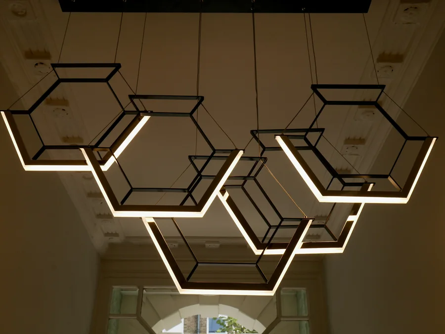
| Hallway and stairs | 3000K | Welcoming. Go brighter, not colder, for older family members, and light every step. |
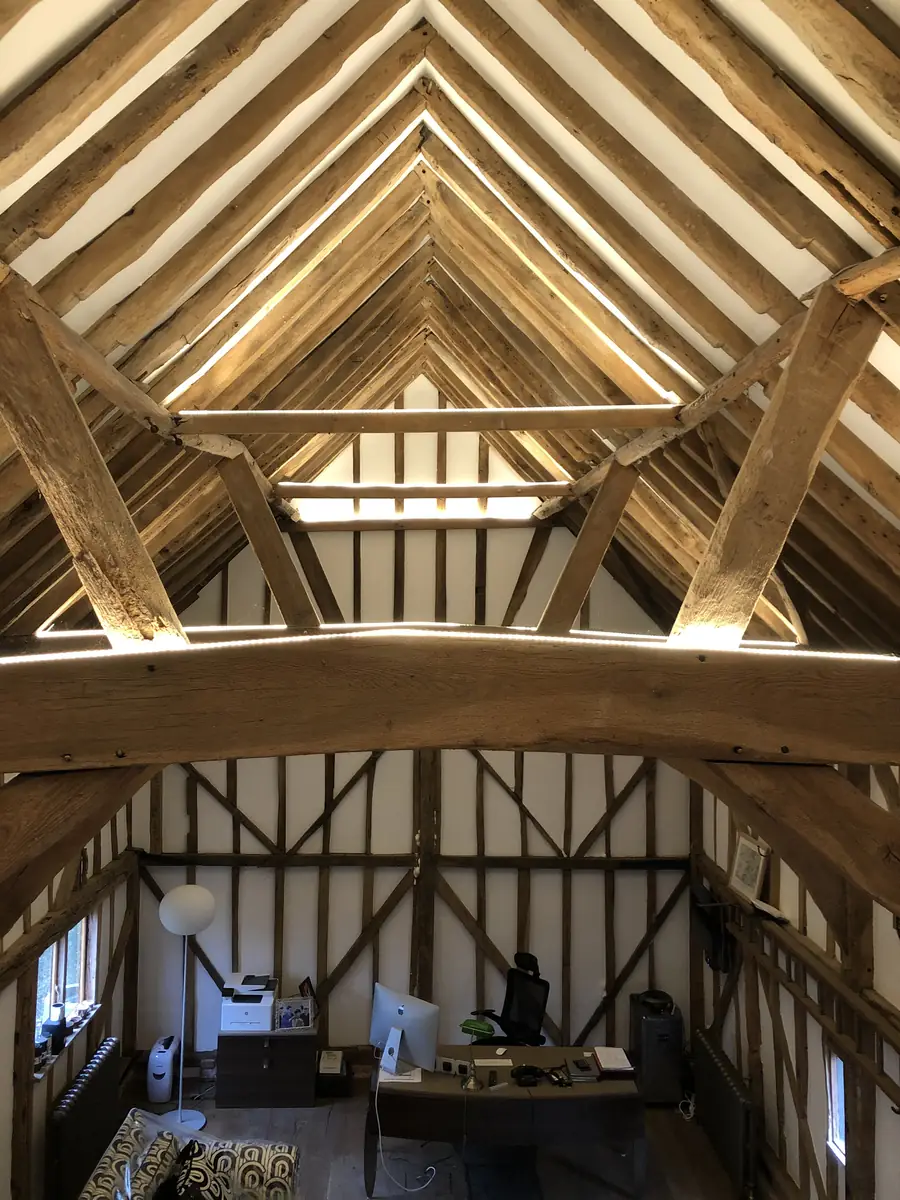
| Home office | 4000K | Alert and clear for screen and paper work during the day. |
| Utility, garage | 4000K | Practical light for practical rooms. |
| Workshop | 4000K to 6500K | Maximum detail for tools and fine work. |
| Showroom | 3000K for homeware, 4000K for tech and cars | Match the light to what you sell, and to where it will end up. High colour rendering either way. |
| Boardroom | 3000K to 4000K, dimmable | Faces look natural on video calls; dim for presentations. |
| Garden and outside | 2700K to 3000K | Softer on the eye, kinder to neighbours and wildlife, and better on brick and planting. |
Looking after an older relative? Do not just swap to cooler bulbs. Raise the light level, cut glare with diffused fittings, add task lights where they read and cook, and light the stairs well. Then let them choose the colour they find easiest. Many will pick 4000K.
Where 6000K belongs
Daylight lamps at 5000K to 6500K are excellent where seeing detail is the whole job: workshops, garages, plant rooms, warehouses, and some shops and medical spaces. In a home they tend to make rooms look cold and harsh, and they are the worst choice for the evening. If you like them in a workshop, keep them there.
How to have it both ways
This is how Russell and I settled it. You do not have to choose one colour for life:
- Colour-selectable downlights. Many good downlights have a switch on the back to choose 2700K, 3000K or 4000K. We set them on the day, and can change them later.
- Tunable white. Smart lighting can shift from cool in the morning to warm in the evening, automatically. See smart home lighting control.
- Dimmers everywhere you relax. Dimmed light looks better warm, and a dimmer does more for atmosphere than any bulb.
- Warm ambient, cooler task. Warm ceiling lights for the room, cooler and brighter light exactly where you read, cook or work.
- Keep each group the same. A ceiling of mixed colours looks like a mistake. Pick one colour per group of lights.
Can a showroom be warm white?
Yes, and for a lot of showrooms it should be. The rule is to light the product the way the customer will see it at home. Furniture, kitchens, bathrooms, flooring, timber, fabrics and gold jewellery look richer and more inviting at 3000K, and customers picture them in their own homes, which are usually lit warm. Cars, white goods, electronics, tiles, stone, silver and diamonds look crisper and cleaner at 4000K.
Whichever you pick, three things matter more than the colour:
- Colour rendering of Ra 90 or above, so a sofa, a worktop or a paint colour looks the same in the showroom as it does when it arrives.
- Accent lighting: adjustable spotlights or track on the hero pieces, brighter than the general lighting around them, so the eye goes where you want it.
- One colour per display. A kitchen lit half at 3000K and half at 4000K looks like two different finishes.
If the same space shows different products through the year, colour-selectable track spots let you change from warm to neutral without changing the fittings.
What about a boardroom or meeting room?
A boardroom has to do two jobs: let people read, write and concentrate, and make them look good on video calls. 3000K to 4000K covers both. Go towards 3000K if the room is mostly for clients and conversation, towards 4000K if it is mostly for work and documents. The European workplace standard asks for about 500 lux on the table and Ra 80 or better.
- Light faces, not just the table. Downlights straight above people cast shadows under the eyes on camera. Add light on the walls, or wider fittings, so faces are lit from the front and side.
- Avoid glare on screens. Keep bright fittings out of the reflection of the TV or display.
- Scenes and dimming. One button for meetings, one for presentations (the front dimmed, the table still lit) and one for video calls.
- Daylight. If the room has big windows, tunable white that follows the time of day keeps the room consistent on camera.
What about offices and communal areas?
Offices, schools and workshops are usually lit at 4000K, with a minimum colour rendering of Ra 80. In the communal areas of blocks of flats, the choice is about safety and seeing clearly. In the sheltered housing schemes we have lit, the lights rest at a low level and come up to full brightness as residents walk through. See our sheltered housing lighting and the nearly 2,000 Designplan fittings we have installed.
Questions we’re asked
Is warm white or cool white better?
Neither is better everywhere. Warm white (2700K to 3000K) suits rooms where you relax and the evening. Cool white (4000K) suits rooms where you work or need to see detail. How much light you have matters more than its colour.
Is 2700K or 3000K better for a home?
2700K is the colour of an old filament bulb and feels the cosiest, so it suits living rooms and bedrooms. 3000K is still warm but a little crisper, which suits kitchens, bathrooms and hallways. The difference is small: pick one and use it throughout a room.
Should I choose 3000K or 4000K for a kitchen?
Most people are happiest with 3000K for the main kitchen lights, so the kitchen still feels part of the home. If you want a brighter, sharper light on the worktops, add 4000K under-cabinet lights, or fit downlights you can switch between the two.
Is cool white better for older people?
Older eyes need much more light, and the lens of the eye yellows with age, which makes warm light look dimmer and more yellow still. More light, less glare and a good task light help most. Many older people do find 4000K easier for reading and close work.
Does light colour affect sleep?
Bright, bluer light in the evening can delay sleep. In one study, people under lighting that turned warmer and dimmer through the evening fell asleep faster than people under fixed 4000K light. Warm, dimmable light in the evening is the safe choice.
Where would you use 6000K?
Rarely in a home. 5000K to 6500K (often sold as daylight) suits workshops, garages, plant rooms and some commercial spaces where seeing detail matters more than atmosphere. In living spaces it looks cold and clinical to most people.
What colour temperature is best for a showroom?
It depends on what you sell. Homeware, furniture, kitchens, flooring and gold jewellery usually look best at 3000K warm white. Cars, appliances, electronics, tiles and silver look crisper at 4000K. Use high colour rendering (Ra 90 or above) and accent lighting on the key products.
What lighting is best for a boardroom?
3000K to 4000K, dimmable, with about 500 lux on the table. Light people's faces from the front and side rather than straight down, keep glare off the screen, and set scenes for meetings, presentations and video calls.
Can I mix colour temperatures?
Yes, between rooms, and between ambient and task lights in the same room. Mixing different colours in the same set of ceiling lights usually looks wrong, so keep each group of lights the same.
Sources: EN 12464-1 (light colour groups and minimum Ra for offices); Kruithof (1941) and later reviews by the Lighting Research Group, University of Sheffield; Fagerhult Lighting Academy on light needs by age; Stefani et al. (2020), dynamic versus static LED lighting and sleep. Our room picks are our own recommendations, not a regulation.
Need it done by a date?
Tell us the deadline. We’ll tell you honestly whether we can hit it — and we usually can.